The data utilized for demonstration purposes was sourced from Kaggle.
Effective dashboards are designed to deliver high-level, relevant information at a glance, empowered by potent visualizations. To enhance this capability, Microsoft has developed an innovative AI feature in Power BI called Q&A, allowing users to ask data-related questions in natural English and receive instant visual answers.
Unleashing the Magic of Power BI’s Q&A Feature
The Q&A feature in Power BI has revolutionized data interaction by allowing direct queries in everyday language, making data accessible to all team members, regardless of their technical expertise. This transformative tool is not just about convenience; it’s a strategic asset for democratizing data analytics.
AI: The Brain Behind Q&A
At the heart of the Q&A feature is an advanced AI that interprets your questions, identifies relevant data points, and selects the best way to visualize the answer. This AI understands context, synonyms, and even the intent behind your queries, ensuring that the responses are not just accurate but also meaningful.
When Should You Use the Q&A Visual?
The Q&A feature in Power BI isn’t just a tool; it’s a versatile asset that adapts to the needs of both dashboard creators and their audience. Whether you’re behind the scenes crafting insightful dashboards or you’re an end-user seeking answers, the Q&A visual offers tailored experiences to suit your role.
For Dashboard Creators: A Source of Inspiration and Efficiency
As a dashboard architect, the Q&A feature streamlines the process of data exploration and visualization creation. It enables you to quickly generate insights and visuals by simply asking questions, bypassing the need for complex queries or navigating through data manually. This not only speeds up the development process but also encourages innovative data presentation methods.
To ensure the Q&A feature works seamlessly, it’s crucial to prepare your data model with clarity in mind. Structuring your fields in simple, plain language is key. This preparation not only facilitates a better understanding by the AI but also ensures that users can formulate questions more naturally.
For Dashboard Consumers: Instant Insights at Your Fingertips
For those interacting with a dashboard, the Q&A visual acts as a direct line to personalized insights. Immediately upon accessing a dashboard, users can engage with the data, asking specific questions and receiving visual answers on the spot. This interaction significantly boosts the dashboard’s value, offering a tailored exploratory experience.
Enabling and Managing Q&A Features
Within Power BI Desktop, the Q&A feature is readily available. To manage this configuration, go to File > Options and settings > Options. Under Current File, choose Data Load. At the bottom, find the Q&A section, where you can enable and disable the Q&A feature and also decide whether to share the synonyms you add to the model with your organization after publishing.

Adding Q&A to a Dashboard in Power BI Desktop
To illustrate how to add a Q&A visual to a Power BI Desktop report, we are using a public Coffee Shop Sales dataset downloaded from Kaggle. For the sake of this example, we have created a simple dashboard that includes some of the main KPIs, graphs, and a matrix. We have also created a separate measures table that includes:
- Average Transaction Value
- Quantity Sold
- Total Orders, and
- Total Sales Revenue.

Keep in mind that a Q&A visual is only as good as the data model behind it, so make sure your data is clean and the data sources are properly connected.
Step 1: Insert a Q&A Visual in Your Report
Decide whether you wish to add a Q&A visual inside an existing dashboard or if you want to dedicate a separate page for it.
To add a Q&A visual, simply click on “Insert” on the main ribbon and either:
- Choose “New visual” and then pick Q&A from the “Add data to your visual” section.
- Choose “Q&A” in the AI Visuals section on the top main ribbon.

In our example, our main dash is already quite busy with visuals, so we decided to create a new page for it. However, if you have space, it may be useful to include the Q&A next to your existing visualizations to offer inspiration for questions (and vice versa!).

Step 2: Format the Q&A Visual
As you can see, thanks to AI, there are already numerous suggestions available to start asking away. Before doing that, let’s first resize and format the Q&A box to match the general theme of the dashboard.
As with any other visualization in Power BI, you can format basically everything about the appearance, dimensions, and position. We ended up with the following version:

Step 3: Train and Customize the Q&A
One of the key benefits of using a Q&A is the ability to customize it to suit the needs of your business and/or stakeholders. For a Q&A visual to be effective, it may require significant training. This process fine-tunes the AI’s understanding of your specific dataset and terminology, making it more aligned with your organizational language and analytical needs.
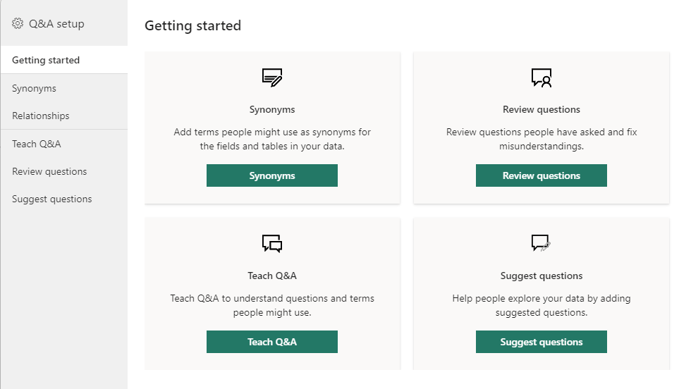
You can access all relevant settings and options for training by clicking on the gear icon at the top right corner of your Q&A visual.
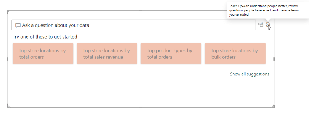
Here, you can:
- Add synonyms for your dataset’s terms. Incorporating synonyms, especially for datasets with unique jargon or abbreviations, enhances the AI’s ability to understand and respond to diverse queries, making the Q&A feature more intuitive and user-friendly.
- Review questions that consumers of the dashboard have asked to refine the model. After you have published your dashboard, analyzing questions from dashboard users provides insights for refining the AI, leveraging real-world interactions to tailor the model for enhanced responsiveness.
- Teach Q&A by asking example questions to determine and resolve any knowledge gaps, ensuring precise and informative responses for users.
- Suggest questions to be displayed for your dashboard consumers to nudge them towards valuable insights. Suggesting queries not only aids in training the AI but also assists users in formulating effective questions, improving the data exploration experience via the Q&A feature.
Decoding the Underlines
When using or teaching the Q&A feature, you might notice words or phrases underlined in blue or red. Here’s what they mean:
- A blue underline indicates that Q&A recognizes the term but might need further clarification. You can click on these terms to select from a list of recognized data fields or measures. As you can see in the example below, simply “product” is a bit too ambiguous, and the model requires further clarification while suggesting possible terms.
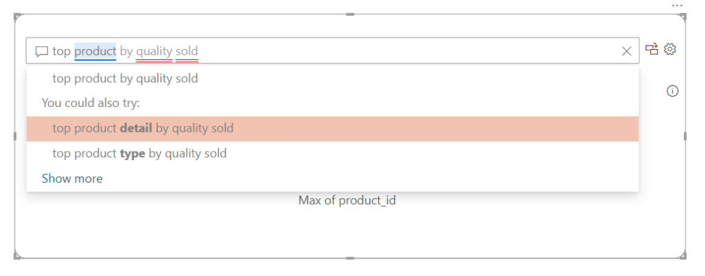
- A red double underline signals that Q&A doesn’t understand the term. This is an opportunity to teach Q&A about new terms or correct misunderstandings. As you can see in the example below, there is no such term used in our data model as “quality sold,” and this should be corrected to “quantity sold,” as this is an existing measure in the model. Nevertheless, AI tries to make an educated guess, which in this case is unfortunately not correct.


As with any other visual, even the colors of the underlines can be modified if you wish. For this, go to the Visualizations pane on the right, choose Format your visual, expand the Questions field menu, expand the Underline menu, and pick any color of your preference. However, it’s recommended to modify these colors only when there’s a clear need or rationale behind the change, ensuring that the visual cues remain intuitive and meaningful to users.
Step 4: Publish to the Power BI Service
Once satisfied, publish your report to the Power BI Service. This makes it accessible to the target audience in your workspace online and allows users to interact with the Q&A feature. Share your dashboard with relevant stakeholders to let them start exploring data through natural language queries.
Post-publishing, you can keep an eye on the questions that the dashboard consumers ask. Based on these, you may consider adding new visualizations to the dashboard.
Turning a Q&A Insight Into a Standard Visual
A standout feature of Power BI’s Q&A is its ability to transform query results directly into standard visuals for your dashboard. Picture this scenario: while interacting with the Q&A, you stumble upon a particularly insightful answer to one of your questions. This insight is not only valuable for your immediate needs but also merits broader visibility on your main dashboard.
To incorporate a Q&A insight into your dashboard canvas, simply click on the conversion icon next to the gear/settings that looks like switching a monitor (see below).
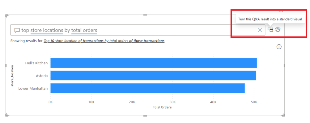
Clicking the conversion icon converts the Q&A visual into the visual generated while querying the Q&A.

Upon converting your Q&A visual into a standard visual, you might think about reintroducing a new Q&A visual to your report. Rest assured, the training and learned understanding of the Q&A feature, encompassing everything from user interactions, audience questions, to synonyms, are preserved within the Power BI service. This means there’s no risk of losing the accumulated knowledge and customizations.
Nonetheless, when you add a new Q&A visual, remember that any specific formatting applied to the previous visual won’t automatically transfer. You’ll need to reapply these formatting choices to ensure the new Q&A visual aligns with your report’s overall design and aesthetics.
Tips for Smooth Conversations with Your Data
To make your interactions as productive as possible, keep these tips in mind:
- Be specific with your questions. The more precise you are, the more accurate your visual responses will be. Unless you explicitly specify it, Q&A will automatically choose the most appropriate visualization to answer your question.
- Use synonyms and variations. Power BI’s Q&A understands natural language, so feel free to ask in different ways.
- Regular Reviews: Schedule regular reviews of the synonyms and review questions in the Q&A setup. This ensures that the AI remains aligned with current data and business needs.
Your Data, Your Questions Answered
At its core, the Q&A feature of Power BI democratizes data analytics, making it accessible, understandable, and actionable for everyone. Whether you’re a data analyst or a business owner, the ability to interact with your data in a conversational manner opens up a world of possibilities for uncovering insights and driving your business forward.
Ready to Transform Your Data Experience?
Diving into your data with Power BI’s Q&A feature is more than just an exercise in analytics; it’s a step towards becoming a more agile, informed, and data-savvy business. So, why not start asking your data the big questions today? The insights you uncover could very well be the compass guiding your business to new horizons.
